Similar Worlds Dark Theme is now released and available for use! 🙂 🌒 🌠
Usage is quite simple. If you'd like to try out SW Dark Mode / Dark Theme, simply do the following:
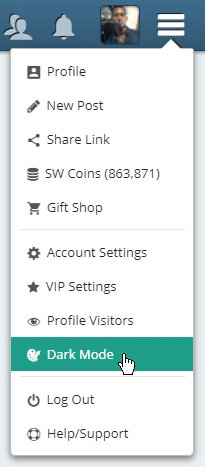
1) Once on Similar Worlds, Press the ☰ "Three Lined Drop Menu Icon" ⏬ on the top-right side of your screen (once the blue bar is visible).
2) Press 🌒 "Dark Mode".
3) Lastly, Press the ⬛ Black Square to Activate Dark Mode!
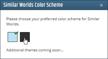
You can always disable Dark Mode at any time, by repeating these steps, and clicking on the Light-Blue box on the last step.
Similar Worlds Original Theme:
Similar Worlds Dark Theme:
This "Dark Theme" can be considered a "Beta Release", as there will be numerous improvements progressively done to this theme, and a few bugs may be found along the way.
Kind regards! Have a great week ahead, and also a wonderful month of May! -The SW Team
[Update]:
Several minor improvements have been made, since this new Dark Theme (still Beta) was released about an hour ago.
Thanks for all the feedback and reporting of bugs/issues that users discovered. 👍
[Update]:
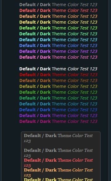
Dark Theme Font Color Improvements ( Just Released! )
----- Live Test -----
Default / Dark Theme Color Test 123
Default / Dark Theme Color Test 123 Default / Dark Theme Color Test 123 Default / Dark Theme Color Test 123 Default / Dark Theme Color Test 123 Default / Dark Theme Color Test 123 Default / Dark Theme Color Test 123 Default / Dark Theme Color Test 123 Default / Dark Theme Color Test 123 Default / Dark Theme Color Test 123 Default / Dark Theme Color Test 123
Default / Dark Theme Color Test 123 Default / Dark Theme Color Test 123 Default / Dark Theme Color Test 123 Default / Dark Theme Color Test 123 Default / Dark Theme Color Test 123 Default / Dark Theme Color Test 123 Default / Dark Theme Color Test 123 Default / Dark Theme Color Test 123 Default / Dark Theme Color Test 123 Default / Dark Theme Color Test 123
(Fixes for User Selected Font Colors - Coming Soon)
Default / Dark Theme Color Test 123
Default / Dark Theme Color Test 123 Default / Dark Theme Color Test 123 Default / Dark Theme Color Test 123 Default / Dark Theme Color Test 123 Default / Dark Theme Color Test 123 Default / Dark Theme Color Test 123 Default / Dark Theme Color Test 123 Default / Dark Theme Color Test 123 Default / Dark Theme Color Test 123 Default / Dark Theme Color Test 123
Default / Dark Theme Color Test 123 Default / Dark Theme Color Test 123 Default / Dark Theme Color Test 123 Default / Dark Theme Color Test 123 Default / Dark Theme Color Test 123 Default / Dark Theme Color Test 123 Default / Dark Theme Color Test 123 Default / Dark Theme Color Test 123 Default / Dark Theme Color Test 123 Default / Dark Theme Color Test 123
[Update]
Dark Theme Font Color Improvements ( Just Released! )
Great job with the dark mode, Andrew!!! I would like to ask for a tweak to the notification pop up, though... it's a little difficult to read the text in the notification box with it having a light background and light text.
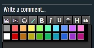
Could you please make SW support alpha channels? I used to just give PNG-images white backgrounds, so that it wasn't noticable against SW's white background, when decorating my posts or "About Me" but now with a dark background, it will be.
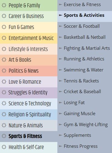
I believe those posts may fit well in this Category (pending release):
People & Family > Self
As for the Post Type/Mood, we do understand that there are some cases where the best mood isn't an easy choice, and that Random isn't always most appropriate as a fallback.
The available options are something we are still considering deeply, hoping to find a most ideal split of choices, without further dilution.
For a post about "Self", I'd use one of the following Moods, based on the nature of what I'm sharing: Positive / Fun / Sad / News
@Andrew Well I can get behind how it's difficult picking 12 moods which can possibly fit anything, of course.
I think you're right; the categories, once finalized, will help the context of mood choices, too. Do we get a choice of where to place our old posts, when that time comes?
@Andrew I was indeed referring to the "Vent" app that exists for Android and iOS.
I should probably have put a harder emphasis on the "it feels like" part of what I said and possibly rephrased it so it didn't seem like an accusation. That's on me. The point I was trying to make wasn't to straight up accuse you of stealing it, but rather indicate that the moods feature is similar enough to what is a big part of the backbone of the Vent app, but at the same time different enough in a way that seems horribly unpolished to me.
Being honest, the manner in which you are rolling out your restructuring changes is in my opinion awful. With the recent introduction of moods, the forced titles in addition to group selection, etc. it now feels like a patchwork of old and new that's hobbled together, and every time I might want to make a very simple post right now I still have to fill out what feels like tax form 221b-43 section 2, alpha, page 3 and 4 in order to just make a post.
It's a transitional period, sure, but this is a messy and excruciatingly long transitional period. In my opinion it would have been better to withhold it you were closer to completion on the grander restructuring, and if you were still set on deploying the changes in multiple stages, have a shorter timespan between. Because, as said, whether I like it or not right now we're just stuck with a patchwork.
The rest of what you're saying though is nothing new to me, nor does it change my position on it. What you're saying has already been directly or indirectly indicated by your team here over the months since you started revealing your plans for the restructure.
I do agree that changes needed to be made, but we have a very, very different view on how to achieve the goals, and maybe even what the goals themselves are.
I'm not saying that the direction you are taking is overall wrong nor right, but the way it is heading certainly does not seem like the site I thought this was, and not the site I wanted it to be. I understand that there is a broad spectrum of users here and that I in this case represent a single user group of many. For all I know the user group I would belong to, the one who finds the proposed changes to be what I didn't want for this site, might be a minority here.
SW is your site (well, those of you who have ownership at least). Whether you choose to make the site you want, make the site you think appeals the the user groups you want to keep and encourage, make the site that gets you the broadest following, or follow the money, that is up to you. Nothing wrong with either. No matter what you choose though, we both know that it is absolutely impossible to appease all types of users, and it seems more and more that the vision you have is departing from what I seek.
To me personally it is moving away from what may SW, well, SW. It is becoming something different from what it was and what drew me here. Yet again, nothing wrong with moving in a different direction. I'll make a judgement call on that when the time comes and enough of the changes have been rolled out, but if it turns out the way I've been given the impression that you intend it to be then it may be the curtain call for me (well, my account here anyway).
It seemed to me that when you started revealing the greater restructure you had already made up your mind on this being the way you wanted to go and had already been developing it far enough that there was no return anyway. That is of course your choice.
So for now I guess we're at a stalemate of sorts. If the posts made by your team over the months is anything to go by, there is nothing you can do to change my opinion on this, nor anything I can do to influence yours. Time will tell if these changes will really be a new start or a springboard for me to look for somewhere else to stay.
In normal mode, the replies that used to be highlighted with a yellow border are no longer highlighted. This makes them hard to ID in a long nested reply stream.
@Andrew I know dark mode is in betta still, just want to make sure this problem is on the too do list.
~ New messages in PM dark mode are NOT highlighted like they are in highlighted mode. ~ New Notifications do highlight but so barely it was hard for me to see.
Other than that, dark mode on the big scale seems GREAT!
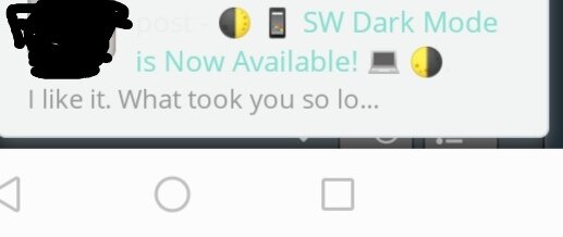
Just now seeing this. It really looks incredible! It does seem to reduce eye strain and the non blue light issue will help with sleep at night, according to studies. I’ve used something similar built into my IPad but this is so much better and I believe healthier. Thank you, @Nuno and the staff very much, for all of the hard work! @Andrew 😊👍