ArishMell · 70-79, M
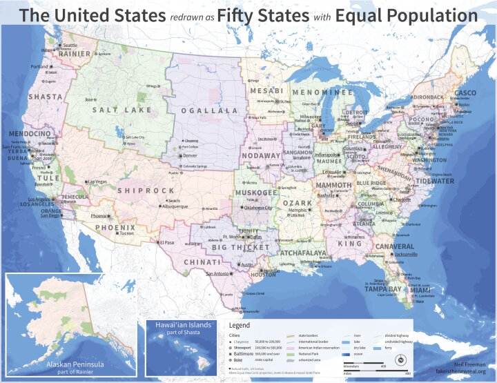
Interesting! It is an ingenious and effective way to show population distribution.
It looks as if they had a lot of fun inventing those State names!
I recall from a few years ago an American talking on BBC radio, pointing out that many foreigners have a rather distorted view of the USA thanks to most news reports, TV shows etc, focusing on the cities like New York, Washington, Chicago and San Francisco. He explained most of the continent is deeply rural, with large regions only sparsely-populated.
I have found it worth buying a proper atlas, as this can be really helpful in understanding news of events, and to some extent their background, from overseas. To take one current example, my atlas is presently on the table, open at the mid-European page, although I needed use Google Earth photos to reveal that Russia already has direct links from its territory to the Crimea, via road and rail bridges across the Kersh Strait.
An atlas whose maps also show ocean-floor relief in reasonable detail, as most do now, also helps you see major earthquakes, tsunami and volcanic eruptions in their geographical context. You do of course need know the basics of these events' mechanisms.
TexChik · F
No thanks . History has to count for something.
View 7 more replies »
midnightrose · F
Interesting. Although, population is always changing so it wouldn't stay equal. I wonder how this would affect government if we all had equal representatives.
RosaMarie · 46-50, F
Gary? Seriously, that's the best name for that area?
TinyViolins · 36-40, M
This is badass. I love the idea behind it, as well as some of the proposed state names. How cool would it be to live in a state called Big Thicket, Blue Ridge, or Firelands?
I imagine that the tourism department for Nodaway is going to have their hands full convincing others their state isn't as boring as it sounds.
Also, as someone born and raised in Houston, it's nice to get a little recognition for your hometown. We're big enough to become our own state.
I imagine that the tourism department for Nodaway is going to have their hands full convincing others their state isn't as boring as it sounds.
Also, as someone born and raised in Houston, it's nice to get a little recognition for your hometown. We're big enough to become our own state.

SW-User
I love alternative geography. Really cool. 😁
That actually looks totally cool.
TheOneyouwerewarnedabout · 46-50, MVIP
What brave new 1984 dystopian stuff is this? 😳
vetguy1991 · 51-55, M
Not sure where i would be
666Maggotz · F
I hate it.
ArishMell · 70-79, M
@666Maggotz @TheOneyouwerewarnedabout I think you are worrying unnecessarily about what may be no more than satire.
If you enlarge the image enough you can read its creator or publisher that Milkshake should really have cited:
It is marked in the lower-right corner as by Neil Freeman, of "fakeistherealnew.org".
The map may well be arithmetically correct, perhaps cribbed from a genuine survey. At first sight with normal screen-size, I thought it was a genuine population-proportion map given fictitious State names to avoid upsetting anyone.
However, with a name like that, it is hard to believe it was any sort of serious boundary review; and I very much doubt there were even any such intentions!
666Maggotz · F
I’m not reading your unnecessary speech that I didn’t ask for. @ArishMell
ArishMell · 70-79, M
@666Maggotz Please, no need to be rude... Why did you hate the map though?


