I will never forget. I will campaign for a better designed profile page until I get it. Or until Nuno kicks me off SW.
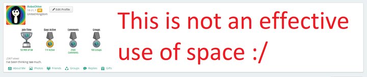
I get that it's better for mobile users, but it just looks ridiculous on a large 16:9 screen. And it's organised terribly for that format.
And changing it for desktop users doesn't mean it'll have to change for mobile users, so that shouldn't be a concern.
SW-User
@RoboChloe it looks great on mobile. so yeah maybe they can change it up a little for desktop? we'll see. they're still changing lots of stuff :D sw is ever evolving
SW-User
@RoboChloe but to be fair tho in that empty space you're missing the gifts :)
The layout has been biased towards mobile users to the detriment of other users, I think. It looks okay in portrait mode but is cluttered and lop-sided in landscape mode (regular computers). SW should really cater for everyone, not just mobile phone users.
@RoboChloe I tagged him on one message but have been ignored completely so far. It's a shame for the rest of us who don't use mobile phones but at least it's readable - then again it was to mobile users before so why 'fix' something that's not broken. I just hope the rest of the site isn't going to follow suit and become 'squashed' as it makes things harder to find and read.
@fazer1k There's no excuse for them really, they can make the site appear different for different aspect ratios/screen sizes, so why they felt the need to actively make it worse for desktop users when they were improving the mobile experience escapes me completely.
@RoboChloe I don't know anything about website development but assuming what you say is right then, absolutely, I agree they should have left the landscape view alone - it was pretty much perfect how it was.
Guys... please calm down. The only reason I heart your comment was because you said "I like it".
I also heart comments that give constructive criticism that actually help us understanding what members want.
Everyone has their opinion, and we should accept them. I wish we could make everyone happy, but since that's impossible, we try the best we can, and the only way to do that is by listening to our users.
@Nuno Yeah i get that part.. my point was if someone doesnt like my opinion on here then they should block me or avoid me instead of butting in a tryin to challenge everything i say
The changes are so minimal, that you can hardly call it an update. I'm still waiting for them to implement full profile pages. They haven't made any changes to it since they created these mini-profiles two years ago. It looks awful. Even the profiles on the experience project looked ten times better than this. Unfortunately it doesn't seem to be a priority for the admins here. They're probably too busy creating more emoticons and stickers.
@Nuno It's especially the style and lay-out, but they also had more additional user information and clearer sections on the pages. It appears disorganized here and large images of trophies and gifts have no business being featured so prominently on the profile pages. I can send you screenshots (including visualisations of the whiteboards if need be) of EP's style and lay-out from the 2012-2015 era if you're interested.
Another important thing from EP that's missing is the user's catalog of stories, dividing them on a month-per-month and subject basis. A feature that's also being used on a lot of blog (wordpress f.e.) platforms.
Thank you very much. I would appreciate very much if you could send us the screenshots to [email protected], so we can have a look. That would be great!