Only logged in members can reply and interact with the post.
Join SimilarWorlds for FREE »

Admin Announcements

🗨 Comments in Home Feed

Hello SW Members! We hope you are all having a great weekend. :)

As most of you may have noticed by now, we recently made a major change to this site.

Comments from your Friends and other Relevant users to you may now appear in your Home Feed, amongst the latest posts which you are used to seeing in this feed.


We understand that this change is very new and surprising to many of you, however we hope that you can give it a chance.

We will be listening attentively to your feedback, as we always do.


Our idea with this change is to add more relevance to users on this site.

Previously before this change, the Home feed was filled with mostly random posts, 90% of which are not relevant or interesting to many users.

(Not saying that your posts are uninteresting! 😄 Just that on average, most of what you see in the feed may not be a topic of interest or from a person you are familiar with/interested in.)

We considered (based on feedback) that many times users feel the site to be "empty" (while our stats show the opposite).
Many times users don't see and engage with their friends and acquaintances often enough, as they'd have to get through 100 other posts which may not be relevant to them.

The aim is that users will now be able to interact with their friends/acquaintances much more often, and join them in topics they would otherwise be unable to find (with the old feed layout), while we also still continue to show all the latest posts on the home feed as we always have.

Please do let us know your thoughts and suggestions in the comments. We are very interested in hearing from you. :)


Other recent improvements to Similar Worlds:

• Improvements to Header and Navigation.

• Removed the "Relevant" Feed, as we wish to simplify our website and improve the main feed instead.

• Display "Edited: xx ago" on Posts, to prevent abuse of the Edit feature (eg: changing the original post considerably to cause misleading answers).


Privacy Improvements and Bug Fixes:
○ "Online" status not showing anymore on the Blocked People list.
○ Removed showing of User Tags in Notifications of comments, if the user is blocked.
○ Fix that emails were not being sent if the user was being mentioned/tagged.


Thanks again for your attention and support!
- The SW Team


Update:
Regarding Comments of Blocked users appearing in the feed.


This is a major bug which was accidentally released with this change.
It is being reverted right now, and we are working on the fixes.
We apologize for this inconvenience.

Please note that mistakes can happen sometimes when major changes are being made to a site.

We don't intend to make changes that would make users unhappy,
however, we cannot move the site forward without sometimes making changes and receiving feedback.

Please be assured that we are listening to all feedback, and will work to come to a solution which satisfies as many users as possible.
Thank you.
Andrew · Admin
Update:
Regarding Comments of Blocked users appearing in the feed.


This is a major bug which was accidentally released with this change.
It is being reverted right now, and we are working on the fixes.
We apologize for this inconvenience.

Please note that mistakes can happen sometimes when major changes are being made to a site.

We don't intend to make changes that would make users unhappy,
however, we cannot move the site forward without sometimes making changes and receiving feedback.

Please be assured that we are listening to all feedback, and will work to come to a solution which satisfies as many users as possible.
Thank you.
Andrew · Admin
@PoetryNEmotion Hello.
As always, the feedback and opinions from members will continue to be important to us, whereby we will listen to your feedback and make adjustments to satisfy users as much as possible; while at the same time keeping things practical for Similar World's continued growth and success.

So far we believe we have a good understanding of what users didn't like about the recent changes, so we are working on improving that, and we believe that members will be happy or satisfied with our following release.
@Andrew I know change is necessary. Could you please send us an advance warning or message so we aren't just thrown into the changes? I hope you will be fair. Thank you for listening.
Andrew · Admin
@PoetryNEmotion We are definitely looking into how we can better communicate our new ideas/changes to members before releasing them.
Also the possibility of having more Beta Testers before releasing new changes.

However, we have indeed been open to members about many changes/features we have planned since our launch.

We have posted many questions, polls and announcements about new features we are planning, specifically major ones that we think users may want to know about in advance.

Behind the scene, we are constantly releasing many new changes on Similar Worlds almost every week. It is very difficult for development progress to require an opinion poll before releasing any changes, as it would greatly stall development.

Additionally, it may be difficult for users to understand/picture the idea we have planned, until they experience it live (where we can get much stronger feedback by them testing the idea).

Still, we will work towards finding some balance between development speed and user awareness of our plans.
Previously before this change, the Home feed was filled with mostly random posts, 90% of which are not relevant or interesting to many users.

Now it's 99% filled with comments that are completely not relevant. Good luck catching a friend's post in this sea of added garbage.
SW-User
@AcidBurn indeed
Pineapple · 100+, F
yeah err... not a fan. at least make an option available in settings so that those of us who want to turn off the comments from friends or “relevant users” can do so?
SW-User
@Pineapple this
SW-User
Horrible change to say the least
Instead of making random ineffective changes as this... how bout addressing bugs like this... the freezing of making a post
[image/video deleted]
@SW-User I thought it was just my phone that did that! I agree with this as well.
SW-User
@Stark yep...
SW, let's address some of the irritating glitches first before making moves like this...
wrong focus
Elessar · 26-30, M
Just to make (almost) everyone happy, can we have a checkbox to turn comments in the feed on/off? Maybe default it to on, but please let us choose, at least.
@Elessar I was thinking that as well. That’d be a nice option to have.
Elessar · 26-30, M
@Stark Indeed. It shouldn't take too much to implement and could even be useful when the site feels empty.
WelshLovely · 46-50, F
Yep, thanks for going the way of Facebook and making needless changes without actually asking the users what they would like. You're making changes that didn't need to be done whilst not delivering on the things that people actually want.
@WelshLovely this is true as well 😅
SW-User
@WelshLovely EP started this crap too at one time.. The masses hated it
GoodoldBob · 61-69, M
The comments showing up out of context with the related stories lose all their meaning. It was an interesting idea but it does not work well.
Carver · 31-35, F
I don't think the changes are a bad idea but I don't think they were executed very well. :/
This comment is hidden. Show Comment
SW-User
It's not the worst change ever, but I do think it looks incredibly cluttered.

Won't some people's questions be drowned out by constant replies to more popular people's posts? Unless you go out of your way to sort by questions only, of course, which would be easier if it was still in the navigation at the top of the page.

Also, the question font for these replies is miniscule. Even on my laptop.
SW-User
Ok. Just move stories and questions buttons back to the top bar.
@SW-User 😂
JupiterDreams · 31-35
I preferred the older version. I find this one too complicated.
Serenitree · F
Change makes me cranky. But the thing I'm noticing most is that the type is so tiny, on the 10" screen im using, I'm wondering if it's even visible on a cell phone screen.
hunkalove · 61-69, M
@Serenitree What I just said. Glad it's not just me!
Rambler · 61-69, M
@Serenitree same.
@Serenitree it’s visible on my phone but it is quite small and honestly gives me a headache. I feel like I’m straining to read it. 😆
This was not needed and only will serve to discourage new users that come here and will send some that are here elsewhere. Old users want their EP-so give them that- Homepage, homefeed and the ability to mute groups. This experiment is a failure.
rottenrobi · 56-60, F
I think it's interesting and am excited to see something different.
As always, I appreciate you're work improving our experience. Thank you.
Carver · 31-35, F
I literally just logged back in to see people's comments in my feed thinking "wtf" and then this post comes up seconds later. XD
Thank You for changing it back. That was very user UNfriendly
DesiDudeJ04 · 26-30, M
please give our old Similar worlds back. 🙏
Gee. For a moment I thought I had gone insane or the laptop was crazy. I will try it. Have to evaluate it first. I won't say thanks yet. Change. Life is full of it.
Interesting, I will admit I could not stand this new update at first. It gave me a headaches with how overwhelming so much had change at once and it’s kind of confusing 😅, definitely will take a while for me to get use to it. After reading this and admin’s logic behind the change, it sounds reasonable and not a bad idea. I’m giving it a chance, thanks for the concern of your members. 🙂
ZenKitzune · F
Please put the questions and stories buttons back in the header.
JoyfulSilence · 46-50, M
Please indent the replies. It is hard to tell what is a main post, and what is a reply. Allow people to collapse the list, or at least just show the first few lines of a reply, and if I want to see more I can expand it.

Right now it is too much to wade through, and poorly formatted.
This comment is hidden. Show Comment
hunkalove · 61-69, M
I'm on an ancient iPod and now the subject of a post is in light green and too small for me to read!
This comment is hidden. Show Comment
TjNewton · M
@RodneyTrotter Its already been changed back
I will also like to say, that it’s nice to see updates happening on the site because it is exciting but a lot of these updates lately have been kind of unnecessary in my opinion. The few post I’ve seen from admin listing new features to be added to the site are always really exciting and interesting but I never see, even suggestions from members. Similar to games being added, group chat options, Instead I see changes like today so it would be great to actually see changes happening that’s been suggested for a while.
Andrew · Admin
@Stark Thanks for the feedback.
One change made today, the reduction of links in the header nav, was to accommodate space for future features such as games.

We are working on these additional new features, however, they can take more time and work than users think.
@Andrew I see 🙂
Wraithorn · 51-55, M
Thank you Andrew and all you SW workers. Much appreciated ! Please ignore the complainers who pretend to speak on behalf of all SW users.
Kudos to the SW team.
Here's an award for you. ☺
wakanda4eva · 26-30, F
Oh cool! I was thinking how come I can't see posts from friends (cos that's why I friend them) haha, I hope I can see all posts from them tho

and also not to mention the groups I'm interested in xD
Nymnin · 26-30, F
I like this change. Instead of seeing question and stories i can see just stories by click Stories.

By doing this kind of filter option i can now see more stories, since people would spam multiple new question making the page load up more stuff that is unrelated to me.

This change is like my gmail. I have labels such as SW and Bills. if i only wanna see SW i click SW and itll shows me everything that has been posted by similarworld. If i wanna see my bills only i click bills and itll only show my bills.

This new feature actually cleans thing up for me.
Serenitree · F
Am I imagining things or are we back to normal? I'm not seeing the teensy, pale green print anymore. The page isn't as cluttered.

But, I deleted a question, and it said it's hidden. Why isn't it deleted?
@Serenitree I didn’t realize it until I commented on a friend’s post that she thought she deleted lol. She messaged me asking how I commented on it because she deleted it I was confused, my friend said that she thought it was a new feature they added and that I was the only one able to see the question because of vip so I asked a question about it on sw and jess explained it to me.
Andrew · Admin
@Stark Hello. VIP users do not have any special feature allowing them to see hidden posts more so than other users.

Hidden posts are removed from view, in Feeds, Groups, Search and Profiles.
Basically they are not "Findable".

However, you can get to a Hidden post if:

1) You already have or were given the direct link to that post.

2) You have a Notification which links to that post.


We now provide our users with an option to Hide a post, so they can remove a post from their profiles, but still keep that post available for other users to continue the conversation that was already active on the comments, and also to keep the post available in the future.

However, if you want to delete the post, you can still do that by pressing the link at the bottom of the popup that confirms if you want to hide or delete the post. You can restore posts until 6 months have passed since you deleted it.
@Andrew oh okay, I was able to see someone’s hidden post on her page so she thought that it was a vip feature.
5thApprentice · 31-35, M
Hey. man I'm down to give it a whirl! Give it a spin at least.
MartinTheFirst · 26-30, M
@5thApprentice You do not know what you're asking for, you were not part of the dark times 😨
@5thApprentice We did, I was a failure that SW ADMIN soon corrected back to how it was. Had you been here you my see the issue differently.
5thApprentice · 31-35, M
@Elandra77 @MartinTheFirst I saw it but my phone died and when I could access SW again everything was back to normal, so I didn't get a chance to give it a whirl. lol
FeetAreFantastic · 41-45, M
I personally don't like seeing comments in the feed. I understand how it could be nice for some, it makes it very cluttered and - more importantly - drowns out new posts. I greatly prefer to just see the newest stories and questions on the main feed.

At least give us the option to filter out the comments.
FeetAreFantastic · 41-45, M
@Jessa29 yeah that would work. But I preferred just seeing both on the same feed. Anyway, this is just my personal opinion. I appreciate you guys trying things out and asking feedback
Nuno · Admin
@FeetAreFantastic Thank you. We will definitely give the option in our next release.
FeetAreFantastic · 41-45, M
@Nuno yay! I really appreciate you making posts like this and asking for feedback.

Ultimately I do respect your choices of course.

Keep up the good work!
DragonFruit · 61-69, M
The “improvement” to the header and navigation is a step backward. I was previously able to set my “Home” to circle/friends only and then shift to “Questions” or “Stories” to view posts from everyone. Now, i have to use 2 steps to get to “Questions" or to “Stories”...or I can choose “All Posts” (which causes the category lists to disappear).
If i decide to go back to “Home” I have to continually reset it.
These changes make the site more cumbersome....that’s NOT better (I like the old version better).

[media=https://www.youtube.com/watch?v=oJa1B89Z3bk]
Tminus6453 · M
I like it, like you said it gives us a chance to view other ongoing topics other than what is available in current time.
MeisterAndrew · 41-45, M
Wish you'd stop making "improvements" and get the basics right first.
JaggedLittlePill · 46-50, F
What is the point of blocking replies from being seen now if they will be in the feed for all to see?
SW-User
@JaggedLittlePill exactly.. that's what the Mute function was useful for imo
Andrew · Admin
@JaggedLittlePill Hello, this is a major bug which was accidentally released with this change.
It is being reverted right now, and we are working on the fixes.
We apologize for this inconvenience.
SW-User
@Andrew Andrew... while we always appreciate logical changes and ideas, please don't follow the path that the admin of EP did...
How about first looking into some of the hang ups/glitches that exist rather than supposed changes that only add steps to navigating.
MartinTheFirst · 26-30, M
What this update should have looked like first time we saw it!


Navigation Menu:

Home - Groups - People - Questions - Stories - Circle Activity


Account settings :
Allow users to see your recent activity in their feed.
☑On

⬜Off


MartinTheFirst · 26-30, M
@Andrew Make the appearance different on differently sized devices. On a laptop or a stationary computer, this layout will certainly fit.

If you use SW on a smaller device then you expect a less optimal layout.
MartinTheFirst · 26-30, M
Or, you could remove the "People" button, replace it with "Circle Activity", and place "People" on home screen. That would certainly free up some space and people would probably not complain. No one needs to be that quick about checking active people.
SW-User
@MartinTheFirst agreed.
Great suggestion
SaraTG · 51-55, T
FormerPadresfan · 26-30, M
Down with the tyranny!!!
rottenrobi · 56-60, F
@PoetryNEmotion Lol! This is why I love you!
@rottenrobi LOL. Love you too, Robi. *beams at you*
FormerPadresfan · 26-30, M
@Pineapple LMAO!!! Don’t worry I’m pro LGBT 😂😂😂😂😂😂. My girlfriend would have murdered me in a most graphic manner years ago if I wasn’t!
NorthernBear · 51-55, M
Judging from what I see in my newsfeed, most people hate the change. I could get used to it.
Serenitree · F
@NorthernBear I can and will get used to it, but I think I need a couple of days. Change, literally, gives me anxiety attacks. It seemed others are allowed to complain, but I'm getting kids telling me to grow up. More fodder for the block box.
Peppa · 31-35, F
Yeeeeaaaaaaassssssssss!!!! Thank you so much x
MartinTheFirst · 26-30, M
Please put the Questions and Stories buttons back in the navigation menu

Dearly - All Sw Members
drymer · 56-60, M
@MartinTheFirst If you click on the "Home" buttom, I get the buttons back..
MartinTheFirst · 26-30, M
@drymer There was no reason for removing them from the navigation menu. It only makes it more difficult to navigate, it adds one button extra to push to get where we want to be.
Awesome! Thank you so much!
DesiDudeJ04 · 26-30, M
Keepitsimple · 51-55, F
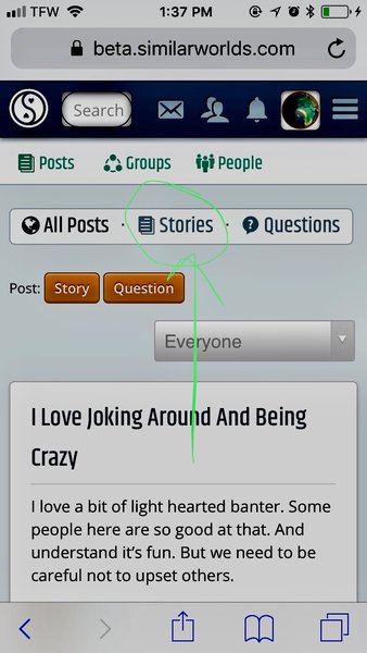
Can we see what it looked like for those that missed it?
Jessa29 · 36-40, FMod
@Keepitsimple here’s a screenshot

Keepitsimple · 51-55, F
@Jessa29 thanks Jessa. It looks pretty much the same just layed out different?
Jessa29 · 36-40, FMod
@Keepitsimple you’re welcome
SW-User
dumpstermeow · 41-45, F
@SW-User I just noticed...I found a way around not being able to see the names...I don't want to mention it here though because of spies. 👀
SW-User
@dumpstermeow I think I know a couple ways
MartinTheFirst · 26-30, M
What's a "Relevant user"?

 
Post Comment