This page is a permanent link to the reply below and its nested replies. See all post replies »
ElwoodBlues · M
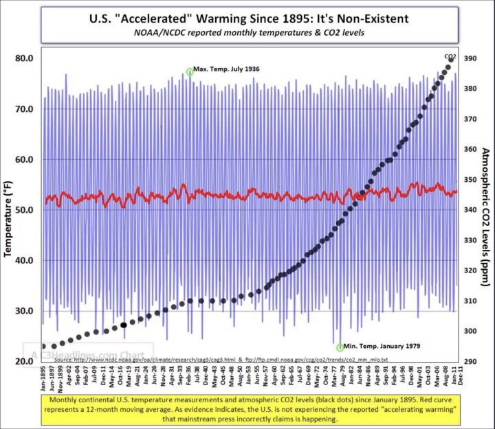
With a scale from 20 to 80 F, it's not so easy to see the 1.5 degree increase. How about if we take the same data, average each year, and plot:

Oh, look, there's been a 1.5 degree increase in the yearly average! And all we did was change the plotting parameters a little bit.

Oh, look, there's been a 1.5 degree increase in the yearly average! And all we did was change the plotting parameters a little bit.
hippyjoe1955 · 70-79, M
@ElwoodBlues The chart I posted is way too short to draw any conclusions but here you want to shorten that even more. Now why would that be???? You and science are truly complete strangers.
ElwoodBlues · M
@hippyjoe1955 says
The chart I posted is way too short to draw any conclusions but here you want to shorten that even more.
DUUUDE!!! Your etch-a-sketch runs from 1895 to 2011. The data I posted runs from 1860 to 2020. Maybe you should read your chart first, because my data runs LONGER than yours, LOL!!!