https://www.businessinsider.com/fox-news-charts-tricks-data-2012-11
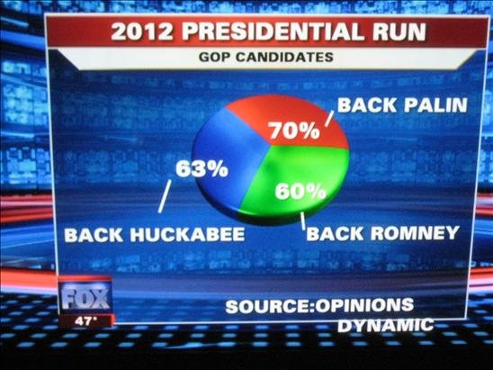
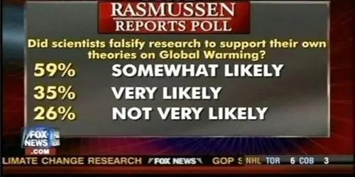
add them up- it exceeds 100%
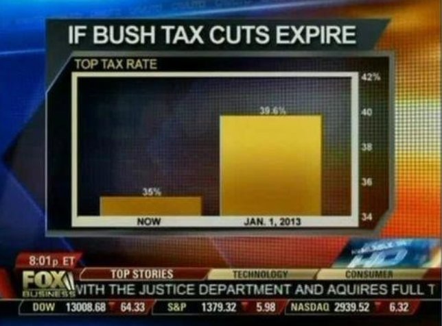
In this Fox News chart, the axis starts at 34%. When looked at it this way, it appears that taxes will be five times higher than they are now if the cuts expire. In reality, that isn't the case:
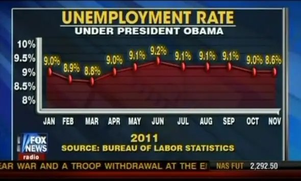
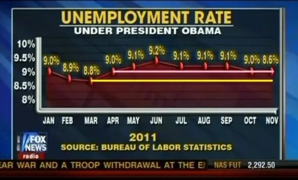
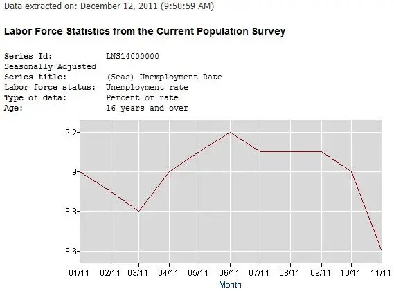
By expanding the scope of the Y-axis and strangely changing the placement of a number of points, Fox News presented the unemployment rate as stagnant. Leeks points out that the BLS data contradicts that conclusion:
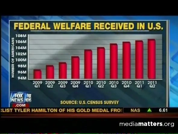
Here's one that makes it appear that welfare recipients are dramatically rising. In reality, the axis starts at 94 million, so the changes are much more subtle:
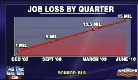
Not only is this graph somewhat skewed, the title isn't even accurate. Moreover, there's no Y-axis to show the difference:
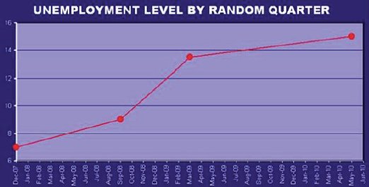
Here's a chart provided by Leeks that shows the differences:
Add up the percentages:
fox news audience are not smarter than everyone else, they're morons suffering the dunning kruger effect
[media=https://www.youtube.com/watch?v=0QbiwDD9Bt8&feature=youtu.be]