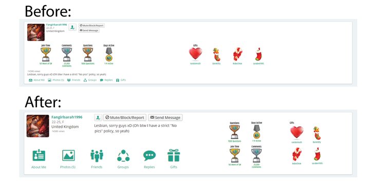
An alternative SW profile design for desktop users
I'm not claiming this is perfect by any means, but I think it's an improvement for desktop users. Makes better use of the space, increases text/image size, fixes some alignment issues (the "send message" and "mute/block/report" buttons are currently different heights, and there are all sorts of weird alignments between elements in the current design).
I could have done more, but I decided to constrain myself to only using elements currently on the profile and moving/scaling them. If I had gone further and designed more, I would have added an "add friend"/"friend added" label, or something similar, next to just the symbol that we currently have, to match the "send message" and "mute/block/report" button styles, along with a few other small design changes and fixes. Nothing major, what we have is already great.
I know the devs work hard to bring us the best SW they can, and I'm not trying to insult their work. They've done a great job. I just think the design could do with some more work for desktop users (I'm fully willing to admit that I couldn't improve it on mobile devices, and I don't think many people could), and I hope they'll appreciate my input and effort. I'm just trying to help. At the end of the day, it's only my time I'm wasting! But I'm wasting it because I care.