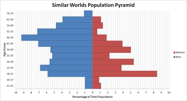
So I set myself a little task: Learn more about the users of this site. To do this, I opened the recently active users page, and wrote down in Excel the amount of people in each age group, and how many are male and female. I did this 3 times, getting me a total of 818 data points.
A very useful tool when dealing with the spread of populations in terms of age and gender is the Population Pyramid. So, I made one using my representative data:
There are lots of interesting things to see in this graph, but the one thing that surprised me most is that the ratio of male profiles to female profiles is approximately 9:5. That's almost twice as many men as women.
If you have any questions about what I did or why I have this much time on my hands, go ahead and ask.
EDIT: As a side note, I did explore the option of using the search bar and searching "aaa", "aab", "aac", etc until I got to "000" so I could count every person on SW, but I would have had to do 46656 searches and deal with doubles. No thank you.
This page is a permanent link to the reply below and its nested replies. See all post replies »
SW-User
Far from exact though. You must choose the population randomly for unbiased results. You could add though "the certain time" at which this much population is active and do a different graph for other significant hours of the day.