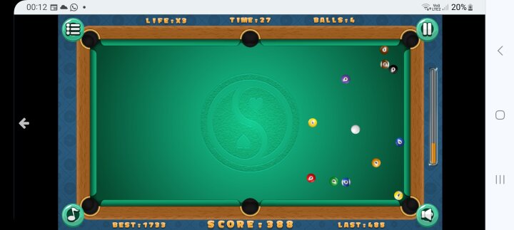
Billiards could do with improvements.
This game is infuriating, maybe it's just the device I play it on but the buttons for sound, to pause, and back out all block the corners of the table so that when you're shooting from the corners you end up jabbing those making it awkward to position the pool cue. On top of that it is difficult to aim and look at the power bar before releasing it. One good thing is that it doesn't show where a ball will go once it is hit by the white ball, I have noticed this in other variations of the game and it makes it too easy, however... maybe a line that shows where the whiteball is going is a good idea. Another thing is the cue is always aiming at the middle of the white ball which is minorly frustrating.
Is it just my device it looks like this on?
Is it just my device it looks like this on?


