


This page is a permanent link to the reply below and its nested replies. See all post replies »

windinhishair · 70-79, M
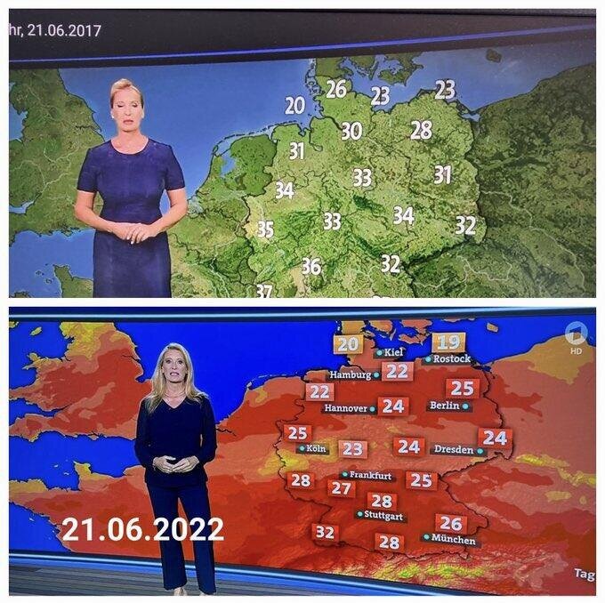
One is overlain on a map showing vegetation density, and the other on a map showing temperature deviation from normal (or something similar). The second is more useful in putting temperatures in context. What is the problem with this? Are objective facts and data left wing?
