Asking
Only logged in members can reply and interact with the post.
Join SimilarWorlds for FREE »

Helping choose a book cover — which do you prefer?

Poll - Total Votes: 32
Cover A (Dark & Dramatic)
Cover B (Navy & Gold)
Both are great
Neither works for me
Show Results
You may vote on multiple answers, up to 2.
I'm working on the cover design for The Answer to Atheist's Handbook by Richard Wurmbrand and I'd love honest opinions from fresh eyes.
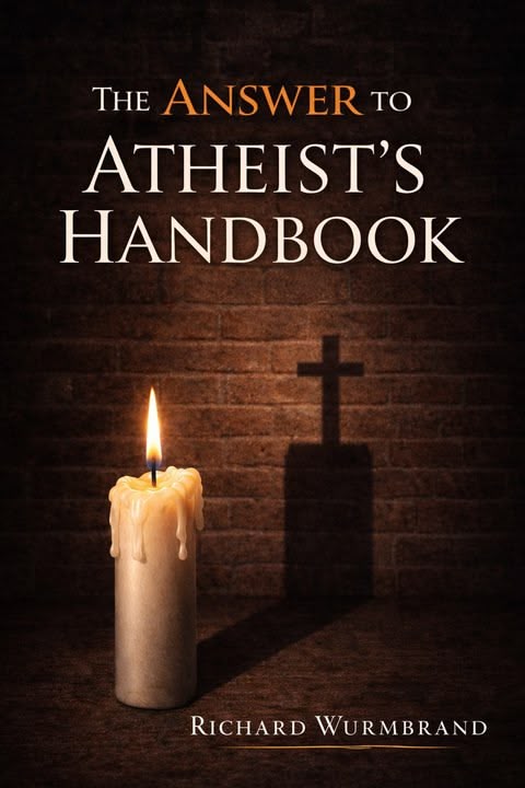
🕯 Cover A — Dark and dramatic: candle casting a cross shadow against a brick wall. Simple, moody, mysterious.
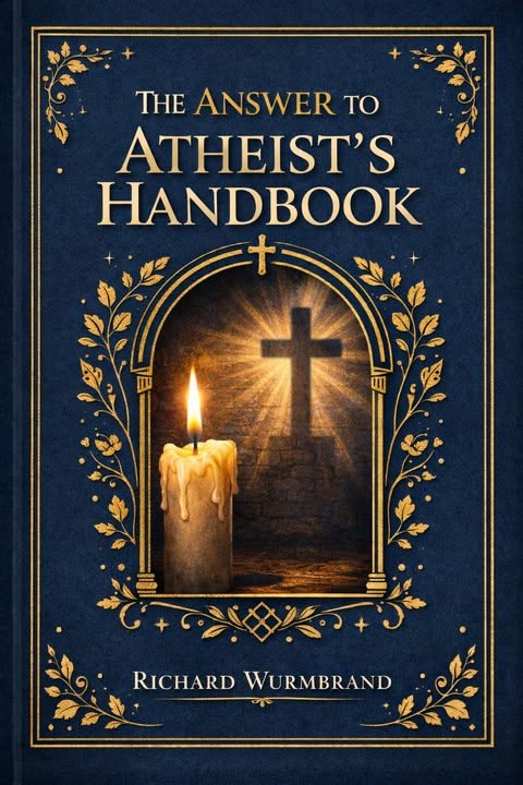
📖 Cover B — Rich and ornate: navy blue with gold borders, an arched frame, and radiant light behind the cross. Classic and elegant.
Which one would make you pick this book off a shelf?
This page is a permanent link to the reply below and its nested replies. See all post replies »
DeWayfarer · 61-69, M
Wrong colors, wrong impression. You really don't want any religious symbols, if you are promoting atheism.

Talk more about why atheism.

There has been far too much talk about why not religion. The points against religion has been over emphasized. Not that they are invalid.

Religion itself, does that type of repetitive brainwashing. So the approach needs to be far more positive about atheism itself.

Atheism is perceived as negative, because of that over emphasis against religion.

Think positive, as well as make a "positive" cover approach. That actually is as well a atheistic approach.

In marketing, the positive approach works better, than the negative divisive approach. Your cover needs to be that positive.

I'll give you a bad example that shouldn't be taken. Your second cover is far too much like "Buckland's Complete book of witchcraft" cover. That book already has a negative connotation.
Daquered · New
@DeWayfarer
Thank you for the detailed thoughts. Just to clarify though — the book isn't promoting atheism, it's actually a Christian response to it. and that’s why the religious imagery is very much intentional.
This comment is hidden. Show Comment
Daquered · New
@DeWayfarer Fair point—the title is definitely bold. The idea is to reflect a direct response to atheist arguments, so the cover is designed to communicate that clearly.
DeWayfarer · 61-69, M
@Daquered A deceit is a lie. And even that is especially religiously speaking.

An atheist might use a deceit to cover a lie. Yet religion? 🤷🏻‍♂

An atheist doesn't believe in absolutes, therefore deceit is fair play. Religion believes in absolutes. Therefore deceit is a lie.
Daquered · New
@DeWayfarer To be clear once again. The book is a Christian response to atheism — the title and imagery are both intentional and accurate. No deception involved.
DeWayfarer · 61-69, M
@Daquered No, no, no!
Most already, and just by the title, believe that your book is about pro atheistism.

Further more, to be deceitful, is to say your god doesn't exist! Deceit is a lie after all.

BTW I initially was talking about marketing strategies. In your believe in absolutes, such tactics are deceits.
Daquered · New
@DeWayfarer Interestingly, you're the only one in this thread who's read the title that way. The book isn't promoting atheism—it's a Christian response to it. Have a good day.
DeWayfarer · 61-69, M
@Daquered I have a like on my initial response not by you.
Daquered · New
@DeWayfarer Thanks, I see that. I appreciate your engagement. Had fun 👋🏾
@Daquered Part of the reason for that conversational thread is the apostrophe punctuation.
That indicates possession something belonging to an atheist.
The title should be "The Answer to Atheists Handbook"
Daquered · New
@LamontCranston Ah, I see what you mean about the apostrophe—that’s a fair observation. I’m working with the given title here, so my focus is on making the cover communicate the intent as clearly as possible.