Working with teal is difficult. It is modern fresh and dynamic.
[image/video deleted]
Finding colours which work with it is a nightmare.
Gold and silver will neutralise it. Pink will enhance it.
I needed something calm it. Black, too much of a contrast. So I finally achieved it with sepia. Notice how it now lifts the caldron to gain centre stage.
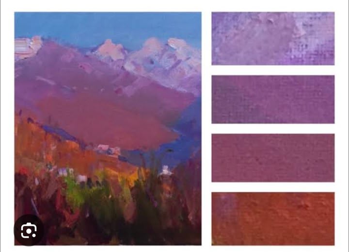
I now have the effect I want. I see the caldron on a mountain edge, with further peaks in the distance.
[image/video deleted]
[image/video deleted]
The painting is complete.
This page is a permanent link to the reply below and its nested replies. See all post replies »
Youve chosen all thr right colours to soften teal: neutrals, creams etc. 👍 I love your blending.
One thing colour-wize that helps with perspective is that colors move to neutral with distance. So if you have a green up close, you add a little of its opposite colour if its in the distance, (red). This is good when you are painting scenes especially with hills or mountians - you go more towards neutral the futher away they are.
Sometimes if you want to be dynamic, you just blend towards the opposite colour, and bypass the neutral
@peterlee its good to see you using so many colours. Too many people are literal with them and forget the expression colour can give to 'feel'. I love how youve blended the colours to create more - it adds depth and reality to it all .