
Top | Newest First | Oldest First

Nuno · Admin
Thank you for your feedback.
Even on desktops, all profile sub-pages are also saving a lot of space in the profile top. Just the main profile page might show more stuff on it, including a bigger profile photo. But still, I found it was indeed saving more space than before.
The reason it seems, for you, that the space is not being effectively used is because you are not showing gifts there.
We will keep your post in mind.

RoboChloe · 26-30, F
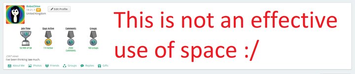
@Nuno Even showing gifts, there are swathes of space left totally unused. There is no point having really small buttons and a layout that is not at all intuitive in that context. There is so much more space to use, why not use it effectively? Instead of leaving it black, or just putting gifts there so it doesn't look totally bare?
I'm working on a example of what I think a better design might look like to try and better illustrate my point that the space could be used so much more effectively.
I'm working on a example of what I think a better design might look like to try and better illustrate my point that the space could be used so much more effectively.
Nuno · Admin
@RoboChloe The problem is that the majority of our users won't have a big screen like you have. I also have a huge screen, but that doesn't mean I should only develop for myself.
With this, I'm saying that yes, you are right that we could use that white space, but unfortunately that means we create a different design for a minority of users.
In most screens (and for most users, since most would show both Gifts and Awards), the current design will be more effective.
If we put the Awards and Gifts in the right side for all Desktop users, it would look weird for most users, because the left side would be line-broken/wrapped (if you know what I mean), because there wouldn't be much space there.
One change we're making now is to move the Profile Views counter and About Me to the top of the Awards/Gifts, for better visibility (again, on smaller screens).
Thank you.
RoboChloe · 26-30, F
@Nuno I'm not claiming to have done more testing than you, but I have looked at the way the site looks on smaller 16:9 devices (1080p, 768p) and the problem persists. Also, and again I'm not saying I have more information than you, the poll I did a while ago about devices used on SW suggests that combined, laptops, desktops, and tablets (devices that would benefit from a better widescreen layout) take up about the same market share as mobile users. Even if that is off by a factor of 2, or even 4, it's still a significant part of the population that's just not being adequately catered to in this update. The opposite in fact.
Just as I've done a mock up design for my large resolution, I've done one that fits in a much more confined space, displays all the information, and still retains the larger fonts and profile pic (albeit scaled down awards and gifts, which I personally think are a bit too big anyway). It's not quite done yet, but I'll post it as a comment on my latest post about this topic when it's ready.
I'm not saying my suggestions are anywhere near perfect, they don't exist to replace what's there. Just to illustrate that improvements can be made.

MeisterAndrew · 41-45, M
I agree. There should be an app rather than designing for mobile users. I don't think most desktop users have a screen size less than 1024x768 but in any case, the correct way to solve a space problem is not to have a fixed design but a variable one so the browser decides when to show element next to each other and when to show them below each other.